Advanced Typography Final project

Week 11- Week 13
Dayyan Ahmed (0344670)
Bachelor in Design (Honors) in Creative Media
Advanced Typography
Final project
Instructions
Lecture
Week 11 - In week 11 Mr.vinod gave reminded us of our final project that he had mentioned earlier in the semester. We presented our ideas and our progression on which he gave us feeback on. Along with the final project he gave us final feedback on how project 1b .
For our final project we were told create a type font that could fix a problem in real life. The type fonts were to be made from scratch and could address any situation of our choice , for eg poster , billboards or company logos
Idea:
For my final project idea i explored a lot of things , from bad type fonts to things such as music cd covers, company logos and packaging designs for which i could potentially create a type font for.
I didn't settle on an idea for a while , however one of those days i visited the Pakistan embassy found in my country. Since i live in UAE which has a big fanbase for tourism there a lot of foreigners that live and visit here.
What i noticed on that visit was the board of the embassy which had all the text written in urdu which is the traditional of pakistan. I could understand it but i saw a ton of people who were struggling to find where the embassy was even when they were standing in front of it .
This sparked my interest and i every time i went out i started noticing that most shops who were run under pakistan owners had no sign of English on them which is considered a universal language. After that i started to reflect back on the time i have spent in Pakistan and there was the same problem it was all in urdu which only pakis could understand That too if someone knew how to read urdu instead of just speak it .
After a little research i found that there was no certain type that related to urdu. Every country has a pride in language however if we look at from a different perspective in terms of explanation and message conveying it was just bad issue .
In the end i decided to create a English Type face derived from urdu calligraphy and lettering.I aimed for the type face to be used in areas ranging from Billboards , posters , Book covers anything that could reflect a urdu background. I chose to do English as it is one of the most recognized language globally
Research and dissections
Urdu lettering is a mix of arabic and farsi language and has the same characteritics as old age calligraphy. Over the years the original calligraphy has been left behind by new variations but i chose the most traditional form of urdu calligraphy.
Dissections and identifying letters
I started by assigning english letters to urdu letters that had a same pronunciation sound and a purpose.
 |
| Figure 1.1 Basic modern urdu calligraphy |
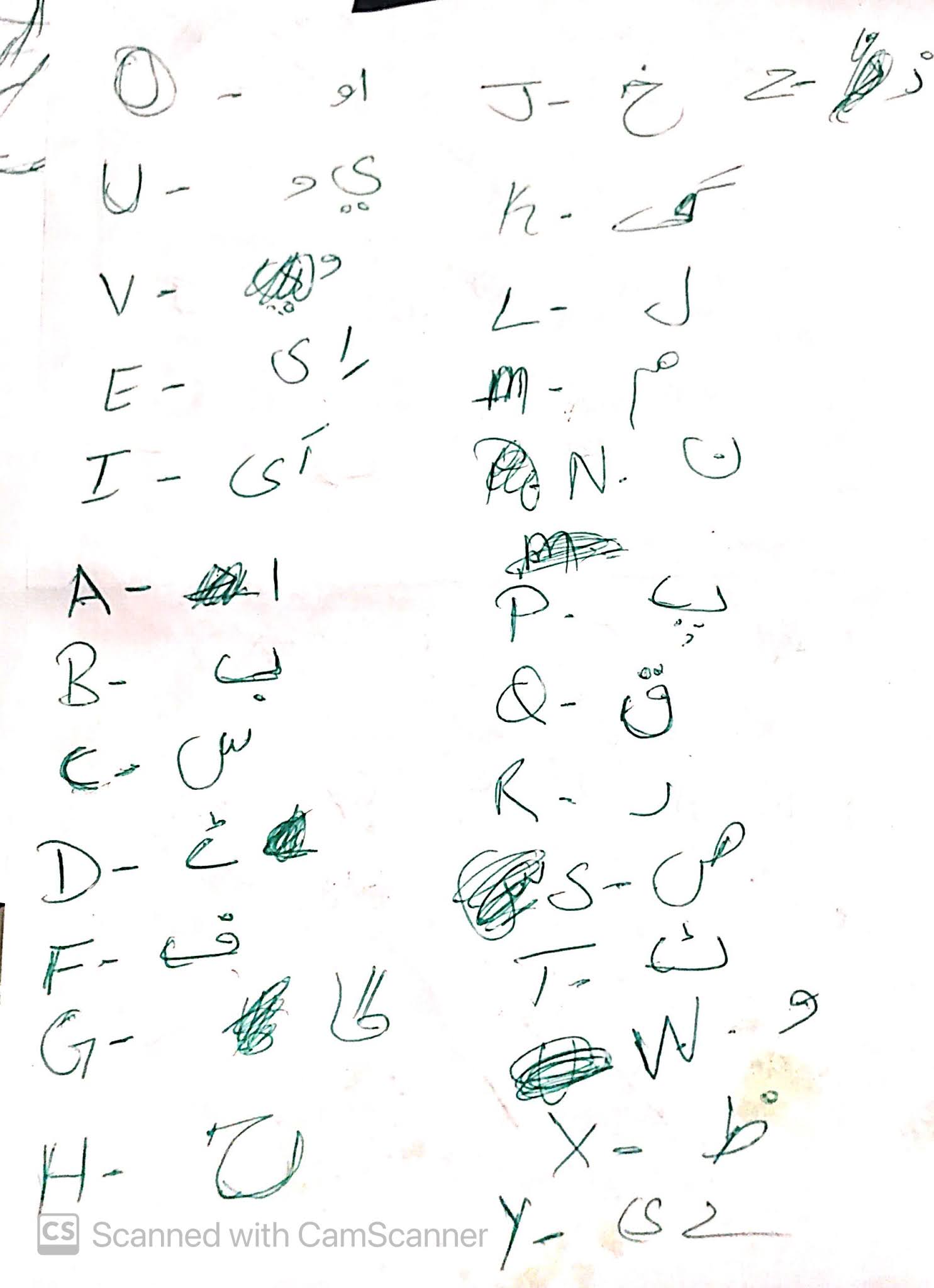 |
| Fig 1.2 Same pronunciations |
I did this stage by hand by printing out the letters. Just as personal preference it just allows me to explore and dissect more easily.
 |
| Fig 1.3 old urdu calligraphy dissections |
 |
| Fig 1.4 dissection notes for reference |
After i got done with my dissections and research i started designing my letters.
Initial letters
 |
| Fig 1.5 designing letters |
This is what my first attempt of letters looked like
 |
| Fig 1.6 first attempted set of letters |
After designing my first set i took a step back and tried to analyze them a little more , i started noticing a lot of problems so i ditched the set.
The problems i noticed were ,
- There was not really a resemblance to the calligraphy because i was not followin a constant thick and thick stroke pattern in my letters.
- Some of the letters not fitting in with the rest of the group because of different characteristics i used.
- The curves and edges i was using weren't really constant through the letters.
After identifying these i started over while avoiding those mistakes.
Re Constructing
 |
| Fig 1.7 reconstruction |
I started doing my construction process again , this time i looked at the letters with more detail and found a basic pattern in the calligraphy style.
- Vertical strokes are thin.
- Horizontal stroke are thick.
Using these as my basic structure i designed my letters , along with using curves that i found in the urdu calligraphy and aslo using spaces already present in the calligraphy letters as the empty spaces for my letter eg, The empty spaces in my letter b are found in multiple urdu letters which look similar to English letters.
Letter forming process
 |
| fig 1.8 new letter shapes |
 |
| Fig 1.9 new letter forms and refinement |
 |
| fig 2.1 new typeface design |
After making my letter forms i showed them to some people who write traditional urdu calligraphy to see if they thought my letter forms looked urdu calligraphy related
The only problem they could give me were the edges of the cuts , As urud calligraphy is traditionally done with a brush type calligraphy pen , the edges are not sharp instead a little curved edgy
so i individually started adding soft curves to all the edges of each letter .
 |
| Fig 2.2 adding soft curves |
 |
| fig 2.3 Further curve and shape refinement |
After making the necessary changes minor and detail , i checked the type face consistency after which i changed a couple of letters , here is the final type face
 |
| Fig 2.5 changes and final type face |
 |
| Fig 2.6 Finalised type design |
After finalizing my type design i moved on to the font lab process
 |
| Fig 2.7 transfer to glyphs in fontlab |
Because the letters i made had a lot of mixed curves and details i had to individually simplify them in illustrator to decrease the anchor points and avoid rough edges in font lab.
I kept each of them side by side to keep the letters consistent while i simplified them
 |
| Fig 2.8 Simplifying and transfer to fontlab |
After transferring all my letters i set the kerning before creating the font
 |
| Fig 2.9 Kerning |

 |
| Fig 3.2 Pakistan cricked team shirt/uniform |
Pakistan Embassy animated logo

Reflections
The final project for me was pretty fun. I actually like making type faces and exploring different characteristics about them. For me the negative point that comes up is my bad time management . I always end up letting stuff pile up which inturn shows in my works which looks very rushed. I'm pretty sure if I managed my time better my results could be a lot better as the topics are actually interesting.


