Task 3: Type Design & Communication
Project 2A / Font Design
Dayyan ahmed (0344670)
Bachelors of design creative media / typography
Ending week - 7 Ending date - 29/5/20
Ending week - 7 Ending date - 29/5/20
Type Design & Communication
Project 2A / Font Design
PROJECT 2A FONT UNDERSTANDING AND CREATION
For project 2a mr, Vinod briefed us about how to dissect different alphabets from different font families , along with that he also showed us different characteristics of a letter font like , cap height ,ascender line . After the brief we were instructed to research about different type fonts and come up with one of our style of type font
For project 2a mr, Vinod briefed us about how to dissect different alphabets from different font families , along with that he also showed us different characteristics of a letter font like , cap height ,ascender line . After the brief we were instructed to research about different type fonts and come up with one of our style of type font
INSTRUCTIONS
WEEK 7-8 PROGRESS
I started off pretty lost , because of the dissections of the font they were hard to get my mind around so my first sketch was
SKETCH 1
 |
| fig 1 sketching ideas |
I tried using adobe calson pro to dissect and design the font but my lack of research well it showed in the sketch
WEEK 8 FEEDBACK
Mr vinod said that the sketch was just not cutting it and that i was rather questionable so i should probably design more
Along with that he also told me about my incomplete portfolio and i needed to update it ASAP and also change the theme because it was creating readability issues
Along with that he also told me about my incomplete portfolio and i needed to update it ASAP and also change the theme because it was creating readability issues
WEEK 8-9
After mr vinod;'s week 8 feedback i quickly jumped back to the drawing bored because mr vinod and the class had already moved on to digitizing the sketches and transferring them to font lab for creation .
I did a little more research and came up with two more font designs
DESIGN 1
 |
| fig 1.2 sketching ideas with dissection |
In this i used bodoni as a reference because of it variation options with the curved serif and thick and thin lines , however i didn't quiet like it yet , i thought it didn't have a differentiate factor in it
So i did a little more research and produced another one
DESIGN 2
I used the same bodoni refrence but added more features of a bodoni font Curved serifs
FEEDBACK 2
Because of how lagging behind the class i was, i couldn't get a very detailed feedback , so i just went with the last design on my own opinion because i thought it had more elements and stood out the most
Because of how lagging behind the class i was, i couldn't get a very detailed feedback , so i just went with the last design on my own opinion because i thought it had more elements and stood out the most
PROGRESS 1
I did a few modifications in the digitized work compared to the sketches because i thought the curved edges protruding from it looked really out of place .
PROGRESS 2
Later i added a few more details .and smoothened , also some curved serifs , i also added a couple lowercase letters , and added ascender , cap , median , base and descender line
During this stage i also picked up few major characteristics of sans serif type fonts
- Very thick with thin lines
- stressed from above
- and small curves with straight lines
PROGRESS 3
I did a little more reading and research , and made quite a few adjustments to my font , this looked the most satisfactory so i continued with this
During the early stages of sketching and designing i observed my sketches were always a lot different from my digitized , so i came to a conclusion i just work better with digitized
mediums
Instead of just finalising the sketch font i started experimenting and testing digitized modifications of the font
 |
| fig 1.6 line heights and illustrator transfer |
So i stretched the font a bit and enlarged it to something i found more satisfactory after which i re did my guides and heights
 |
| fig 1.7 last process editing |
I did go through a lot of trial and error process in illustrator and fontlab to get a suitable satisfactory design look
FINAL DESIGN FONT
FONT LAB AND POSTER
After designing our font we were given a tutorial and instruction on how to transfer our glyphs into fontlab and how to kern and set spacing between our letters
Like so i transfered my glyphs with simple copy paste into the designated letter space , also setting the cap height , ascender , descender and x height in the font settings
after transferring all the letters to font lab we had to open a metrics window to begin the kerning process of all the letters
I started by setting all values to zero then replacing them with a constant value in this case 50 , moving on from there i started individual kerning , and also setting spaces
This was to omit any huge empty spaces between two letters or increasing spaces between letters which was more my case as my font design was very contrasting with thick and thin lines
After setting the kerning and spacing after a lot of trial and error process i finalized on the values and generated the font to install on my laptop
after transferring all the letters to font lab we had to open a metrics window to begin the kerning process of all the letters
 |
| fig 1.1 kerning in font lab |
This was to omit any huge empty spaces between two letters or increasing spaces between letters which was more my case as my font design was very contrasting with thick and thin lines
After setting the kerning and spacing after a lot of trial and error process i finalized on the values and generated the font to install on my laptop
 |
| fig 1.3 export font type |
I named my font SKINNY FATTY it doesn't sound very professional but i think it was the most describing because how contrasting my font lines were either very thick or very thin
POSTER
After taking a through look over the last overall progress and design to check if everything was on track i saved and installed the font on my laptop to create a poster
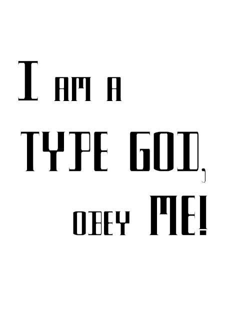
We were given a line 'I AM A TYPE GOD, OBEY ME !' which we had to set up as a poster format
Progress 1
For progress 1 i started by just free hand allignment of the words just to catch an idea of what i can work and then i proceeded to actually make a couple layouts that i could use for the poster
For progress 1 i started by just free hand allignment of the words just to catch an idea of what i can work and then i proceeded to actually make a couple layouts that i could use for the poster
This was my first layout i wanted to keep it simple but also emphasize in the main idea of the poster which in this case i thought was very commanding like im a god u obey me so thats what i based my layout on.
Along with that i wanted to align the line 'I AM A' and 'OBEY ME' while increasing the TYPE GOD size to really keep everything aligned and emphasised
For the second layout i kept everything pretty much similar standard 3 by 5 , but i started playing which different text alignments like top bottom
And i really thought this layout could be something so its what i based my final layout on
Third layout
I wasn't planning on doing this layout but it looks pretty nice compared to the other two even tho its super simple , i think with a little kerning and leading this should be fine
 |
| fig 1.4 preview mode check |
I did do a couple other layouts
Just to check which alignments look better i think explorations and trial and error play a huge role in typography
so after quite a bit of changes , experimentation , looking around and stuff i ended up making confirming this layout
 |
| fig 1.6 finalized layout |
and mainly because how the I in the first sentence really kind of reflected the ! i really liked that look , but still emphasising on the type
I did have to add a fair bit of kerning and leading just to get that satisfactory look and after this i exported it for submission
FINAL OUTCOME
Project A specific feedback
-Your portfolio is badly formatted, a pdf file is not made to public.
-Type design is good but the poster is not that good
Revised poster layouts for improvements
Layout 1
 |
| revised layouts |
Layout 2
 |
| revised layouts |
Finalized poster after revised layouts
FEEDBACK
Week 7:
specific feedback :
-update eportfolio
-finish incomplete work
-update feedback
-finish project before deadline
Week 8:
General Feedback:
- Final JPEG must be exported (BW) 300dpi and uplaoded to your eportfolio
- You must embed your Final PDF layout (only final in PDF format)
- You must make your document visible to everyone in Google Drive
- Mention demonstration of briefing occurred during class, if no formal lecture
- Further reading must be accompanied with an image of the book or the site.
Week 9:
specific feedback
-type font is good but poster is not
-fix editing of e portfolio for submission
Project A specific feedback
Project A specific feedback
-Your portfolio is badly formatted, a pdf file is not made to public.
-Type design is good but the poster is not that good
REFLECTIONS :
For me this project was actually kind of fun , maybe because the amount of different choices we had to experiment and over all i did grow some interest in typography which was pretty unexpected , it also helped me realize how much effort and time goes into things like posters and type fonts which normal people usually overlook as very simple things .
FURTHER READING


