Task 3: Type Design & Communication
Project 2B / Typography: Expression, Hierarchy & Composition
Dayyan ahmed (0344670)
Bachelor of design creative media / typography
Ending date - 10/6/20 Ending week -13
Type Design & Communication
Project 2B / Typography: Expression, Hierarchy & Composition
Bachelor of design creative media / typography
Ending date - 10/6/20 Ending week -13
Type Design & Communication
Project 2B / Typography: Expression, Hierarchy & Composition

PROJECT 2B TEXT POSTER ANIMATION
Project 2b was the continuation of project 2a concepts, we were breifed about how we had to choose a quote or line and then make a poster using slight visual elements such as lines etc and then move on to animating the poster.
INSTRUCTIONS
Progression week 9-10
Through week 9 we chose a line that we want to make a poster out of, we were given time to explore different lines , i chose a couple lines which were
- ENJOY YOUR FREEDOM
- MONEY IS NO PROBLEM BUT PROBLEM IS NO MONEY
- I'M NOT CRAZY , MY REALITY IS JUST DIFFERENT THAN YOURS
I was trying to keep my line choices short and simple while keeping in mind if i can express them properly in typographic format including the animation later
Progress 1
I started of my project exploring the second line MONEY IS NO PROBLEM BUT PROBLEM IS NO MONEY , i just had a thought that it was a catchy statement but also included letter like S and O for which i had ideas like
Using dollar sign for the S
Using a coin for the O
Reflecting on whatever was taught through out the semester i had picked up that to start any type of text editing first thing is to choose a type family and a type font , something that can convey the idea of the text
I started my process in indesign to make layouts and kerning
i chose the font family FUTURA STD mainly because it has a lot of different type font which i could use to show differences eg: bold against light condensed
Layout 1
 |
| fig 1 grid system layout for poster |
This is the first grid system i used i was making a rough draft so i did'nt record a lot of progress for this design
Poster design 1
 |
| fig 1.1 poster 1 |
In this first draft i used the font FUTURA STD bold and light oblique , i used the bold to emphasize on the main subject of the poster ,
Which i found to be was MONEY and PROBLEM
Besides that i used dollar signs in places of S to reflect the money factor , i intended to use the dollar signs as the word IS
The alignment i used here was , the smaller text alligned as one and the main MONEY on top with the dollar signs
WEEK 10 CONSULTATION FEEDACK
General feedback:
- Don't stretch type faces
- Decrease the use of too much graphical elements
- Don't use colour , if the poster doesn't look good in black and white it wont look good in color
Specific feedback :
- The use of the dollar sign as the word IS not working
- decrease kerning between the dollar sign and text
- Try to fit the dollar sign with the rest of the text
Progression week 11
After week 10 feedback i started diving into deeper research about posters and what characteristics of a good poster sets it apart from the other
With some research done i started making more poster layouts using the same line MONEY IS NO PROBLEM BUT PROBLEM IS NO MONEY
Layout 1
 |
| fig 1.2 poster layout 2 |
I tried to reflect on the feedback and tried to fit everything in one allignment while still keeping the emphasis factor
I also change the type fonts i used i thought an oblique font describes money better in a luxurious way , i used futura std bold oblique and light
Progress 1
 |
| fig 1.3 poster formation |
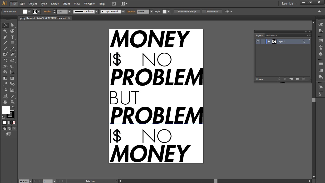
After setting my kerning and leading in in indesign i moved the text to illustrator to add the graphical elements which i used here was the dollar sign
Also i didn't use a random web picture dollar sign , i crafted it myself so that it seemed like a a part of the rest of the type font
layout 1 outcome
 |
| fig 1.4 poster 2 |
Layout 2
After the last layout i went on to explore more different ideas and layouts , i also did some additional research on what type of graphical elements can and cannot be used in typography
i found that its better to use additions to the type font letter itself to minimize foreign graphical elements but more expression through the text itself
 |
| fig 1.5 poster variation |
So i came up with this design the grid layout i used is the same as before but i tried different font type but still futura std ,
Also in this layout i used the same dollar sign concept but with an additional symbol in the O where i added a line in the o to make it look like a no entry symbol thus showing the NO
 |
| fig 1.6 poster 3 |
Although i liked the ideas i was using here , i didnt like the allignments and overall look it was giving so i just kept it as a draft
Also for this design my animation plan was to have the no entry sign do a single revolve and then back to their original position
WEEK 11 CONSULTATION FEEDACK
General feedback:
- Come up with a various ideas; not just one. Produce more sketches.
- Think typographically and reduce visuals.
- Since we are producing a poster, the orientation must be portrait.
- Stick to the ten typefaces given.
Specific feedback :
- I did'nt consult about my progress so i kept to general feedback
Progression week 12
Through week 11 i spent time trying out more different layouts and i also decided to try the other two lines that i had chosen
MONEY IS NO PROBLEM BUT PROLEM IS NO MONEY
more layouts explorations
layout 1
 |
| fig 1.7 further explorations |
i did a couple more layouts for this line using a rough grid system, i also took a slightly different approach
instead of using graphical elements in the letters i tried to make the background and the contrast colors to express the text
 |
| fig 1.8 further variations |
the main reason i was splitting the background was to show the difference in the two lines , because they are contrasting statements
I slpit the BUT down the middle to the show the difference taking place, i used it as a catch in a statement eg: My semester went pretty good BUT it was bad because of my lack of time management
Layout 2
I quite liked the splitting idea but i also heard mr vinod and mr shamsul say that there has to be a very specific reason in splitting down the back ground or else it is not very highly recommended
 |
| fig 1.9 further variations |
In this variation of the poster the grid and the concept was the same i was just playing around and exploring different possibilities
ENJOY YOUR FREEDOM
After quite a lot of exploration on the previous line i decided to try out the other two lines to see if they can give a better outcome compared to the last one
For this line i actually looked around in magazines and articles to get an idea of what i can do and my inspiration came from one of my own shirts
Layout 1
 |
| fig 2.0 poster layout exploration |
I made this layout but i used two type families here , gillsans std and futura std , both in bold i just like their look , i also ended up kind of dissecting the gills sans because i had to slightly stretch the word freedom
Layout 2
 |
| fig 2.1 poster formation |
Yeah at this point i was trying different positions of the words to see what could work ,
after this i did one in colour cux my initial idea was in color
Outcome b/w
 |
| fig 2.2 b/w poster |
layout with colour and texture
 |
| fig 2,3 addition of colours |
I wanted to do something like this and then animate the background in a moving pattern changing directions to get that sense of freedom
Outcome
 |
| fig 2.4 outcome |
I found this one pretty catchy but i dropped it because
- i had to stretch type fonts , which is a big no no
- The text was not describing the poster but the graphical background was.
Moving on to the last line i had chosen i had to kind of start from scratch here because of how long the line was and the meaning of the lin e
The type family here i chose was Universe ltd 65 bold , 55 roman , 73 black extended and 93 extreme black extended , i chose this type family because the amount of variety and diversity of font type it provided
Layout 1
 |
| fig 2.5 layout exploration |
i got the idea from a music convention poster it was a heavy metal band poster , but i really liked how everything aligned up and how the key words were emphasized upon
Along with this layout to me at least really expressed the line it self by using the different point size of the letters and almost no graphical elements , it also gave me a lot of ideas of animations
Outcome
 |
| fig 2.6 outcome |
The point of this layout was to show the difference between my view and some other person view , hence the keywords i identified here were DIFFERENT and CRAZY
so i the word crazy i arranged in a manner that seems out of place from the rest of the text but still is aligned with the 'IM NOT' on the top left , giving it that crazy factor
Then i put different in a opposite alignment to portray the different factor from the rest of the text I chose this as my final poster for animation
Animation process
For my animation ideas first i figured which words i wanted to animate for that i chose the key words different and crazy ,
Animation ideas
- DIFFERENT fades in and out in opposite allignments and CRAZY jumbles up and moves back to original position.
- DIFFERENT keeps changing allignments while CRAZY keeps moving in a wave motion
I chose animation 2 because it seemed easier to do but looked quite effective , the first animation would increase to more than 24 frames but i would still try it
Progress animation 1
For the first animation idea i made 9 frames , with the base time interval as 0.2 seconds , but along with that i used 0.1 time intervals between frames that i was just changing the opacity of the word different , to keep the animation moving .
 |
| fig 2.7 animation process |
For the first animation idea i made 9 frames , with the base time interval as 0.2 seconds , but along with that i used 0.1 time intervals between frames that i was just changing the opacity of the word different , to keep the animation moving .
Animation
 |
| fig 2.8 animation outcome |
Progress animation 2
 |
| fig 2.9 variation animation process |
For the animation process i did 5 frames at 0.2 second intervals , each frame contained each letter of CRAZY moving to form the wave motion and in each frame the alignment of DIFFERENT changes
Animation
 |
| fig 3.0 variation animation outcome |
After my final edits i went through my project again to check for errors and noticed the margins were not aligned on the top and bottom so i fixed it
Margin alignment adjustment
 |
| fig 3.1 alignment adjustments |
Final submission JPEG AND PDF
Poster

Animation

FEEDBACK
week 10:
General feedback:
- Don't stretch type faces
- Decrease the use of too much graphical elements
- Don't use colour , if the poster doesn't look good in black and white it wont look good in colour
- The use of the dollar sign as the word IS not working
- decrease kerning between the dollar sign and text
- Try to fit the dollar sign with the rest of the text
Specific feedback :
- The use of the dollar sign as the word IS not working
- decrease kerning between the dollar sign and text
- Try to fit the dollar sign with the rest of the text
Week 11:
General feedback:
- Come up with a various ideas; not just one. Produce more sketches.
- Think typographically and reduce visuals.
- Since we are producing a poster, the orientation must be portrait.
- Stick to the ten typefaces given.
Specific feedback :
- I didn't consult about my progress so i kept to general feedback
Week 12:
General Feedback:
- Generally, how to deal with white space is the point.
- The poster must have an idea. Identify the key words.
- They have potential for ideas. Focus on strengthening the visual impact.
Specific feedback :
- I did'nt consult about my progress so i kept to general feedback
Week 13:
specific feedback:
- Poster reflects the idea
- Don't stretch type face use enlargement
REFLECTIONS
Week 10-13:
In these weeks while doing project 2b i realized a lot of stuff , like how to express a statement using typography while at the same
Also how to use minimal graphic elements to express the phrase , along with that its very critical thinking because of the diversity
In addition to that i did learn a bit of organization of work too , related to my portfolio
FURTHER READINGS


